I’m building this as a Marine Corps bird. Before, and during the early parts of, WWII, Marine squadrons would be made up of old aircraft that the Navy had already used to death, or aircraft that the Navy didn’t want. After the Corsair had difficulties with carrier qualifications — stiff landing gear, bad visibility over the nose, and it’s just a HUGE aircraft — they sent them on to the Jar Heads. The aircraft’s issues didn’t affect shore-based use at all, and the Marines proved them to be such an excellent plane that the Navy resolved the carrier handling issues and eventually began to ship Corsair squadrons on carriers.
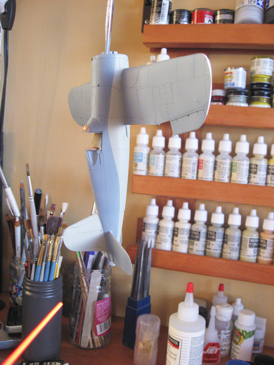
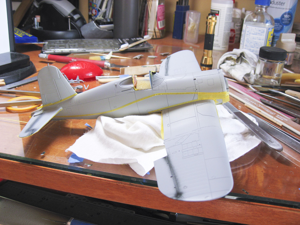
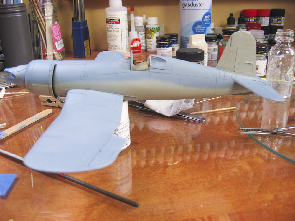
This model is painted in a two-tone scheme. The specific aircraft is “Marine’s Dream” named after the nose art that will be on the cowling. The colors are US Navy Blue Gray, and Light Ghost Gray. The more I think about it, the less sure I am about that gray color, but it looks okay in person, so I’m sticking with it. I used Model Masters Acrylic paint. I sprayed the Gray as it came out of the bottle; I cut the Blue Gray 80%:20% with white. The Blue Gray is a hard color to match, but I’m really happy with how it looks on the model.
“Marine’s Dream” has an odd demarcation between the Blue Gray and the Gray. Normally the Gray wouldn’t come up so high on the fuselage, but it does on this bird. I initially laid out the demarcation between the colors with tape. After spraying it and removing the tape, I gave it a light sanding to knock off the edge from the masking tape, and then went in and did the demarcation line free-hand, using my Sotar 20/20 airbrush, ultra-thinned paint, and very low air pressure. I had to go back and fourth between the two colors maybe four times to get it all looking right, but I’m happy with the results.
Something the photo above brings up is the cowling alignment. It’s not as straight as it should be. Something I need to address before permanently attaching it.
One note on the Blue Gray paint. It didn’t cover as well as I wanted in its two initial coats, but the thinness of it in areas gives the effect of faded and weathered paint. I quite like the look.